Creating a calm and relaxing atmosphere in your home starts with the colors you choose for your walls, furniture, and decor. Colors have a powerful effect on mood and can influence how comfortable and peaceful you feel in a space. If you want your home to be a sanctuary where you can unwind and recharge, selecting calm colors is a great place to begin.
In this post, we’ll explore practical tips to help you choose calm colors for your home, so you can design a space that feels tranquil and inviting.
Why Choose Calm Colors?
Calm colors are typically soft, muted, and gentle on the eyes. They help reduce stress and promote relaxation, making them perfect for bedrooms, living rooms, and any area where you want to feel peaceful. Unlike bright or bold colors that can energize or stimulate, calm colors create a soothing environment that encourages rest and reflection.
Popular Calm Color Families
Before diving into how to choose calm colors, it helps to know which color families tend to evoke calm feelings.
– Blues: Soft blues resemble the sky and water, naturally promoting a sense of calm and serenity.
– Greens: Muted greens remind us of nature and growth, providing a refreshing and relaxing vibe.
– Neutrals: Shades like beige, cream, gray, and soft white are versatile and create a clean, peaceful backdrop.
– Lavenders and Soft Purples: Gentle purples add a subtle touch of elegance while maintaining calmness.
– Pale Pinks: When muted, pinks can feel comforting and warm without being overpowering.
Tips for Choosing Calm Colors for Your Home
1. Consider the Room’s Purpose
Start by thinking about the function of the room. Bedrooms benefit from soft blues, pale greens, or neutrals to encourage sleep and relaxation. Living rooms can handle slightly warmer tones or muted pastels to promote comfort and socializing without overstimulation. Bathrooms and reading nooks are great places for serene greens and blues.
2. Test Samples in Natural Light
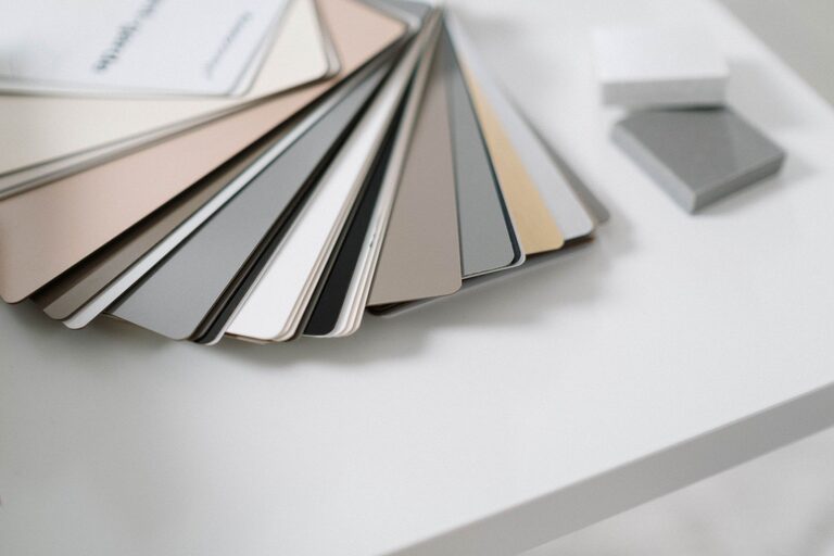
Color can look very different depending on lighting. Always test paint samples on your walls at different times of day. Natural light will show the true tone of your chosen calm color, while artificial light can warm it up or cool it down. This helps you avoid surprises after the paint is applied.
3. Use Color Combinations
Don’t be afraid to blend several calm colors for depth and interest. For example, pair a soft blue wall with warm beige furniture and pale pink accents. Using complementary calming hues adds balance and prevents the room from feeling flat or dull.
4. Pay Attention to Undertones
Subtle undertones in paint colors can change how “calm” a shade feels. A blue with a hint of gray feels more muted and relaxing than a bright blue with green undertones. Ask for paint swatches or samples to compare undertones before making a final decision.
5. Incorporate Texture and Materials
Colors can feel more calming when combined with soft textures like linen curtains, plush rugs, or natural wood furniture. These elements work together with color to create a cozy and inviting atmosphere.
6. Avoid Overly Bright or Saturated Colors
Bright reds, neon greens, or intense oranges tend to energize rather than calm. Even if you love a bold shade, try using it sparingly as an accent rather than the main color. This keeps the overall feel peaceful but still allows you to include colors you enjoy.
7. Use White and Neutral Shades as Anchors
White and neutral shades like soft gray or cream help balance calm colors and prevent the room from feeling too dark or overwhelming. They also create a clean, open appearance that boosts the sense of tranquility.
8. Bring in Nature Through Color
Nature-inspired colors tend to be inherently calm because they connect us to the outdoors. Shades like moss green, sky blue, sandy beige, and stone gray mimic natural surroundings and help establish a peaceful indoor environment.
How to Apply Calm Colors in Your Home
Walls
The most impactful place to use calm color is on the walls. Choose a dominant calm color and paint all or most of the walls to set the tone for the room.
Furniture and Decor
Use complementary calm colors on furniture, throw pillows, rugs, and artwork. These help reinforce the tranquil feeling and add layers to your design.
Accents
Select small accents in contrasting but still gentle colors to add personality without disturbing the calm mood. Examples include vases, picture frames, or lamps.
Final Thoughts
Choosing calm colors for your home is a wonderful way to create a peaceful retreat. By considering the room function, testing samples, combining complementary hues, and incorporating natural elements, you can design a space that supports relaxation and wellbeing. Remember, take your time exploring different shades and trust your instincts about what feels calming to you. Your home should be a place where you feel comfortable, refreshed, and truly at ease.
About the Author